Adiworld
Project specifics
- Role: Web Developer
- Application type: Web-Anwendung
- Application category: Sport
Client information
Zu diesem Zeitpunkt war HTML5 kein Modename mehr sondern eine ernstzunehmende Entwicklung des W3C und der WHATWG. Es gab jedoch noch keine CSS 3 Unterstützung für adaptive (responsive) Templates wie sie durch Skeleton, Bootstrap oder Zurb gegeben werden. Um die Anforderungen des Kunden zu erfüllen entschied sich das Entwicklungs-Team dafür zwei verschiedene Version – eine für Desktops und eine für mobile Endgeräte – auszuliefern.
Die Version für mobile Endgeräte wurde mit Hilfe der CSS 3 Techniken für alle verschiedenen Auflösungen mobiler Endgeräte flexibel gemacht (responsive).
Die Herausforderung bei diesem Projekt war, dass es keine Photoshop Templates for die Versionen auf den mobilen Endgeräten gab. Das hat die Arbeit etw. erschwert wurde jedoch erfolgreich bewerkstelligt.
Desktop
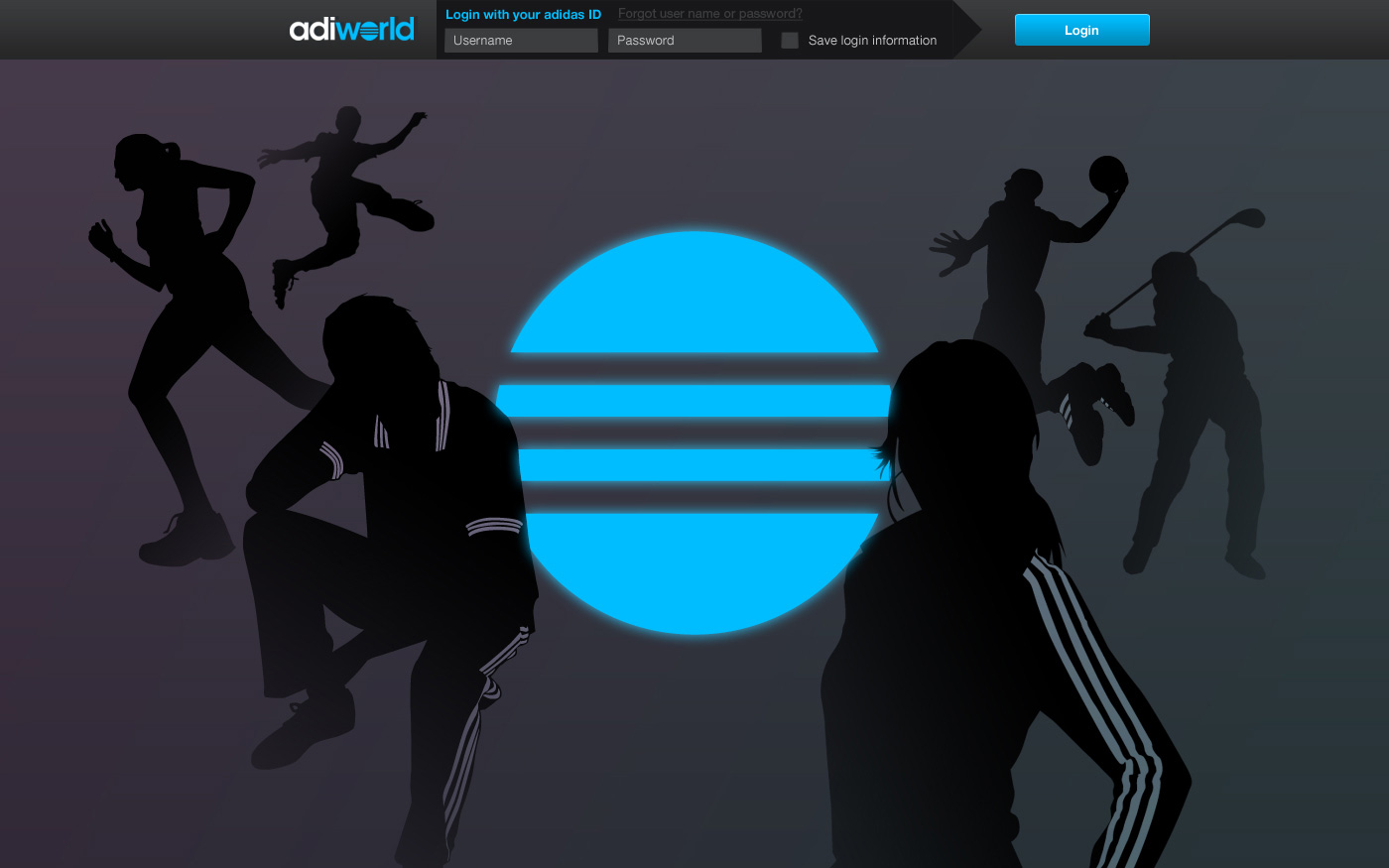 Fig. 01
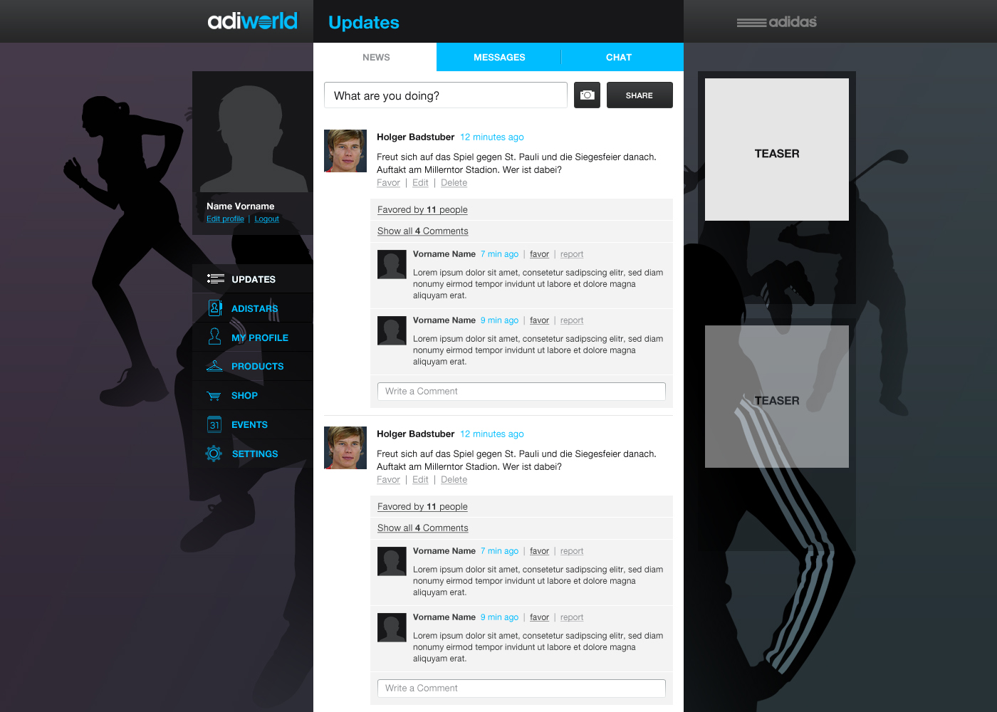 Fig. 02
Mobile
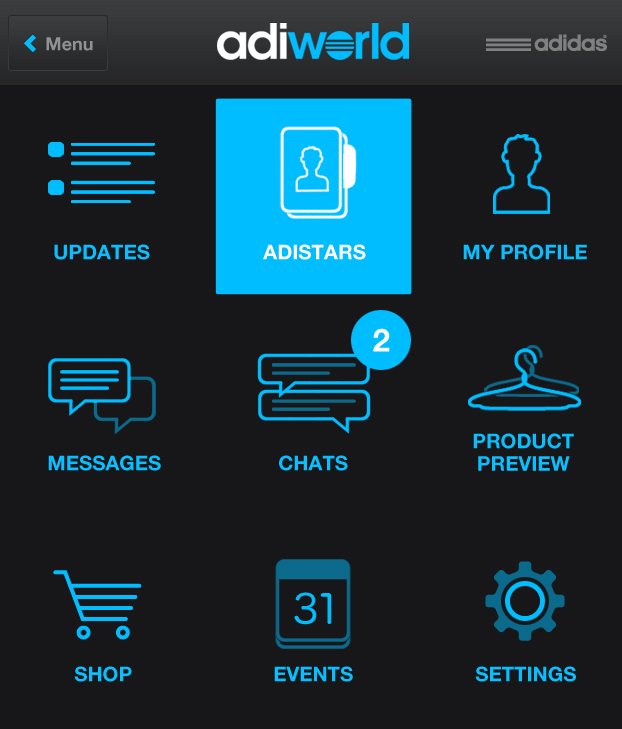 Fig. 01
Technical Features
- Platforms: Mobile, Tablet, Desktop
- Project Group: Greenfield
- HTML5: Yes
- Responsiveness: Responsiv
- Browser Compatibility: IE8+
Tool Support
- IDE: Eclipse
- Server: Apache
- Platform: Linux
- Version Control: Git (cmd)
- Bug Tracking: Trac
Project specifics
- Role: Web Developer
- Application type: Web-Anwendung
- Application category: Sport
Client information
My Services
- Frontend Services
- Responsive cross browser compatible HTML template creation